
NICU Parents Responsive Web App
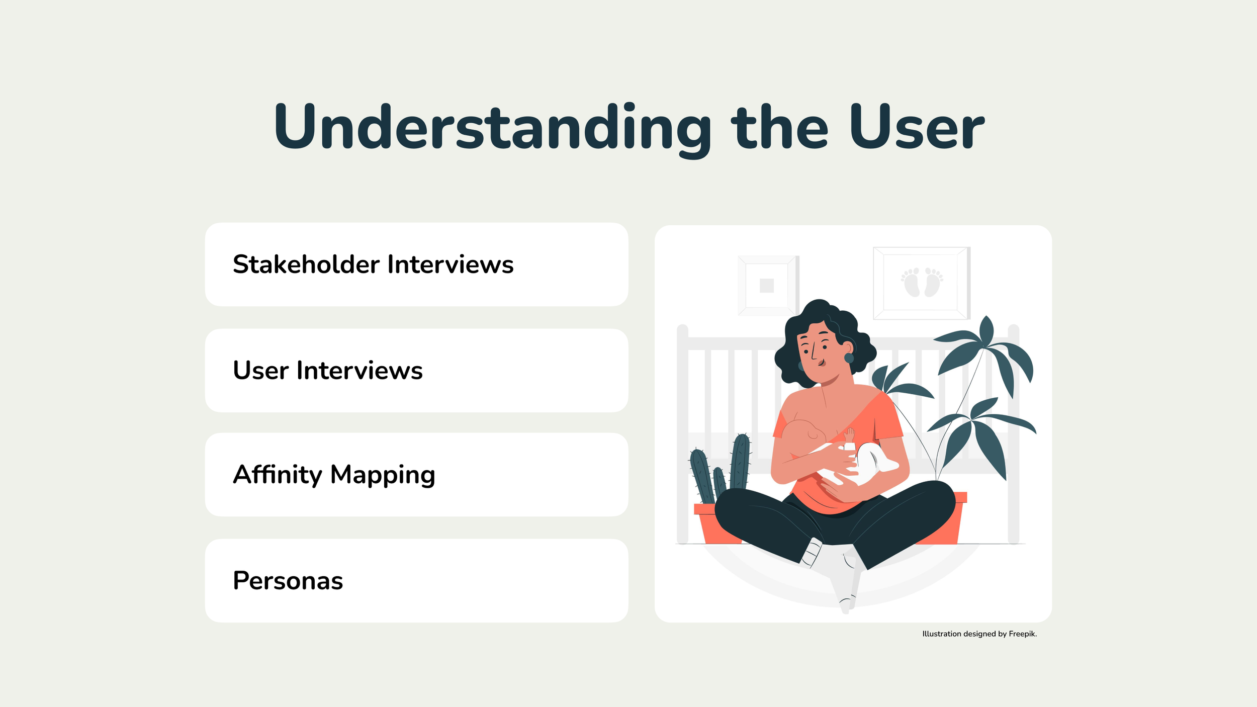
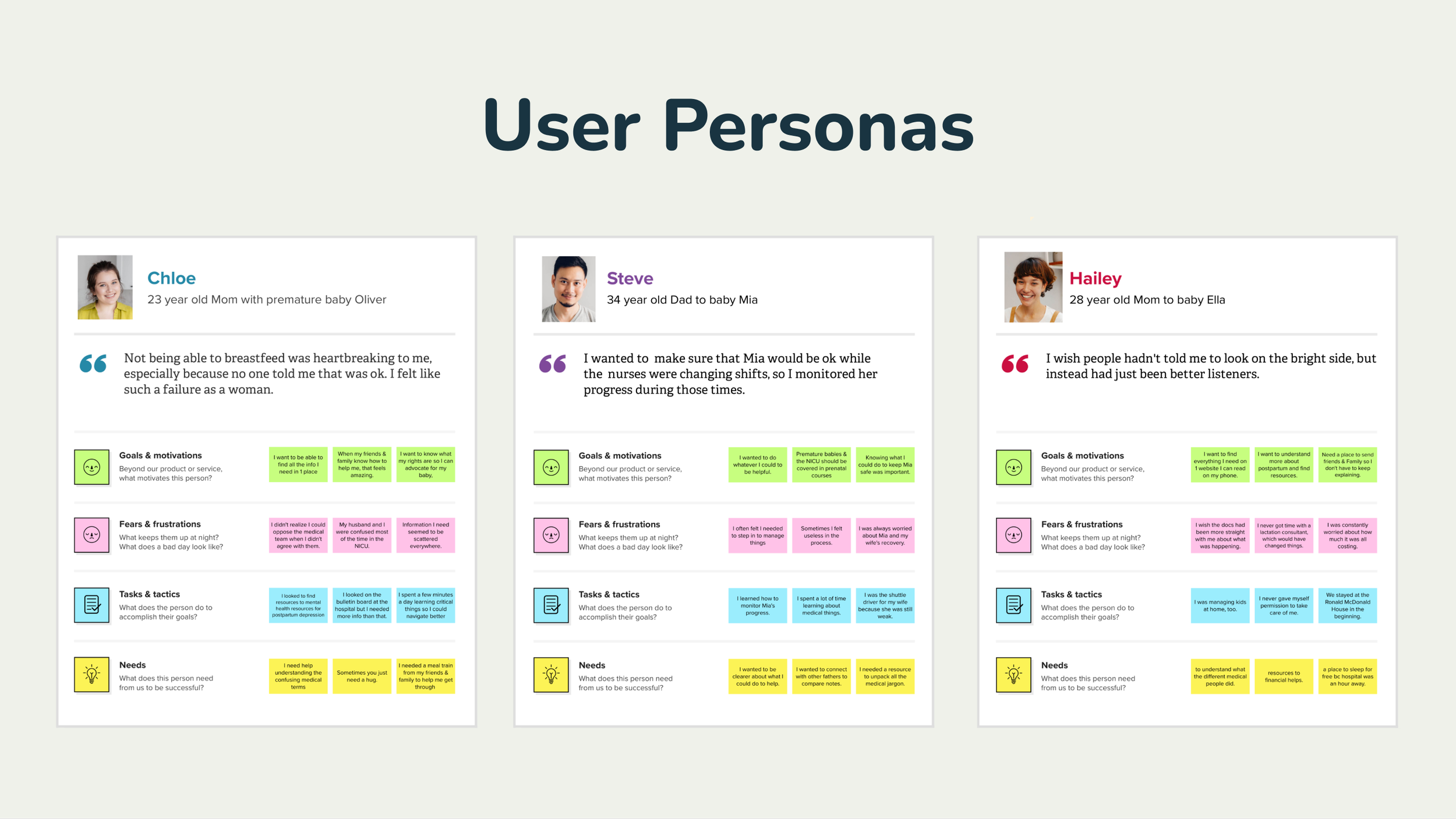
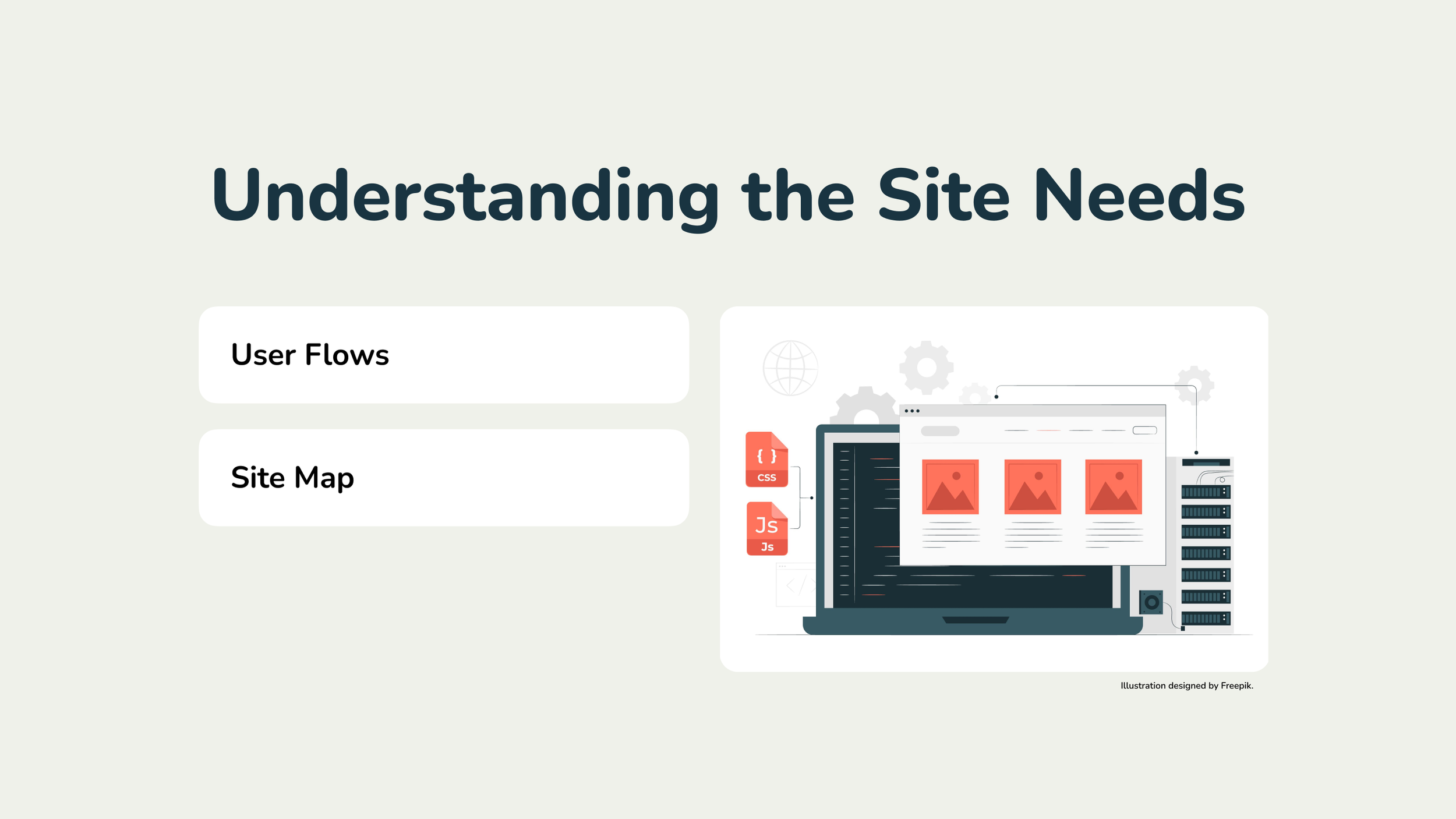
Our research team had an important task at hand - to identify who would be using this website, a site for new parents with premature babies in the Neonatal Intensive Care Unit (or NICU). The project’s stakeholder had a singular vision — to present all of the information in a visually compelling form that felt more like infographics than a traditional website. But what information did users actually need on the site? And who would be visiting it?
UX Research & Design Lead, Content Strategist, Picture Editor


Reflections.
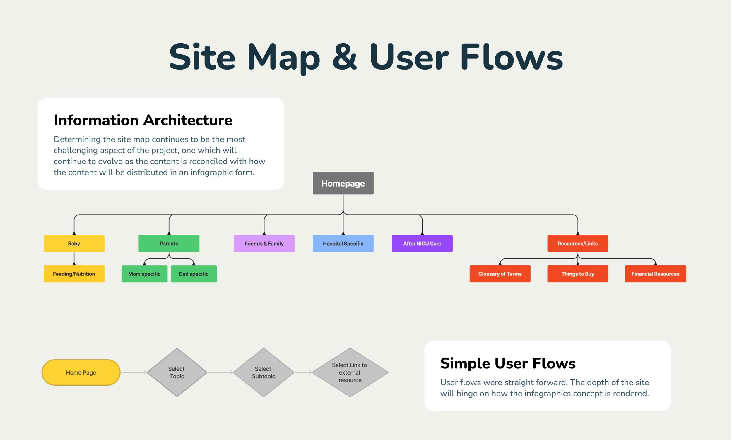
Responsive Design. Communicating the technical limitations or incompatibility of an infographic approach in a responsive design was challenging as our stakeholder did not understand that the same infographics rendered as a static image, which appeared on desktop, would not necessarily be legible on mobile. I learned new ways of explaining this.
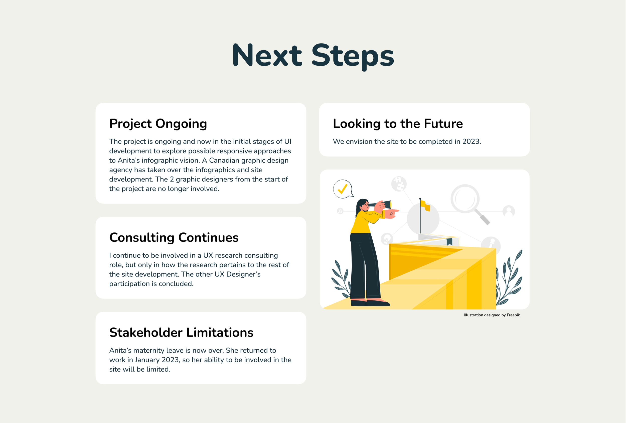
Scheduling. As our team members (other new parents) were offering their services on a pro bono basis, coordinating schedules with availability was difficult. The project has gone much more slowly than anyone anticipated. Our team needed a great deal of patience.
Infographics challenges. In this case, exploring visual approaches with experts in data visualization or responsive information graphics, along with developers simultaneously may have been efficacious in conjunction with our research work to pave a smoother way for the graphics/UI team.
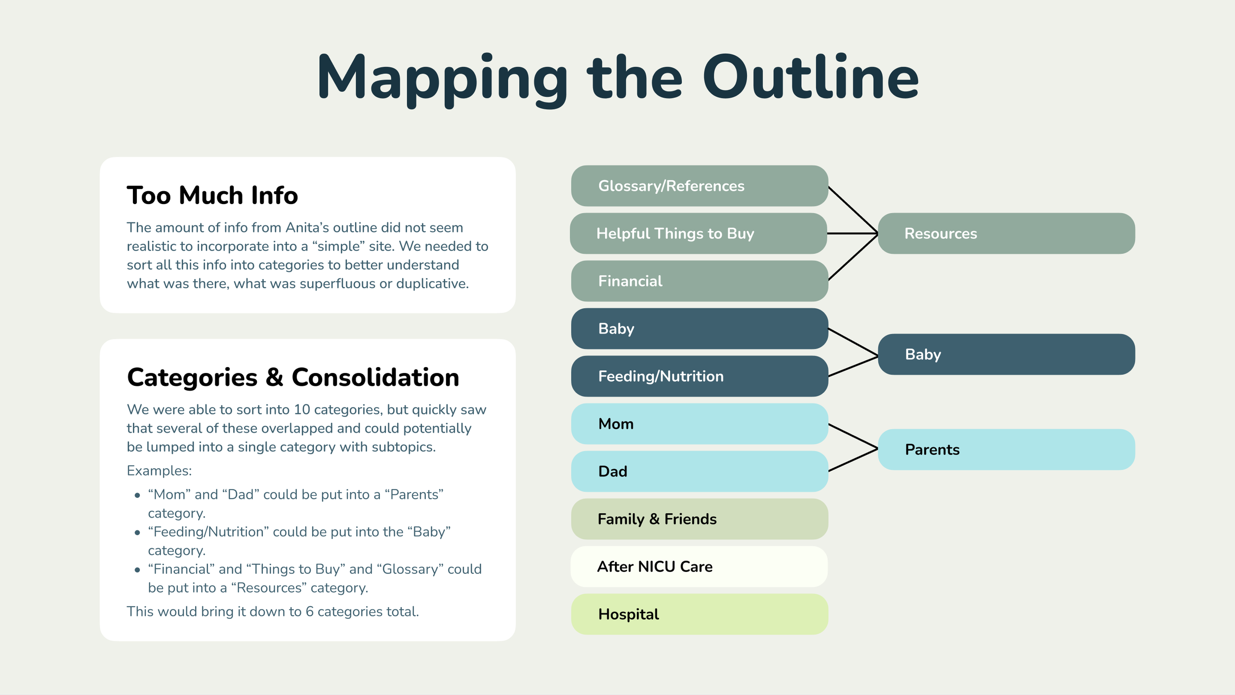
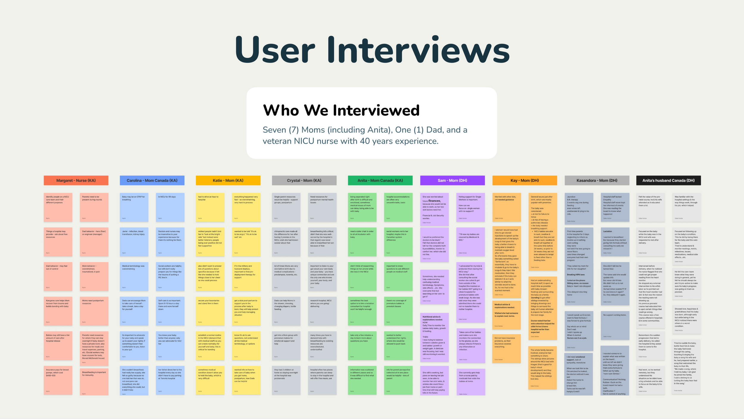
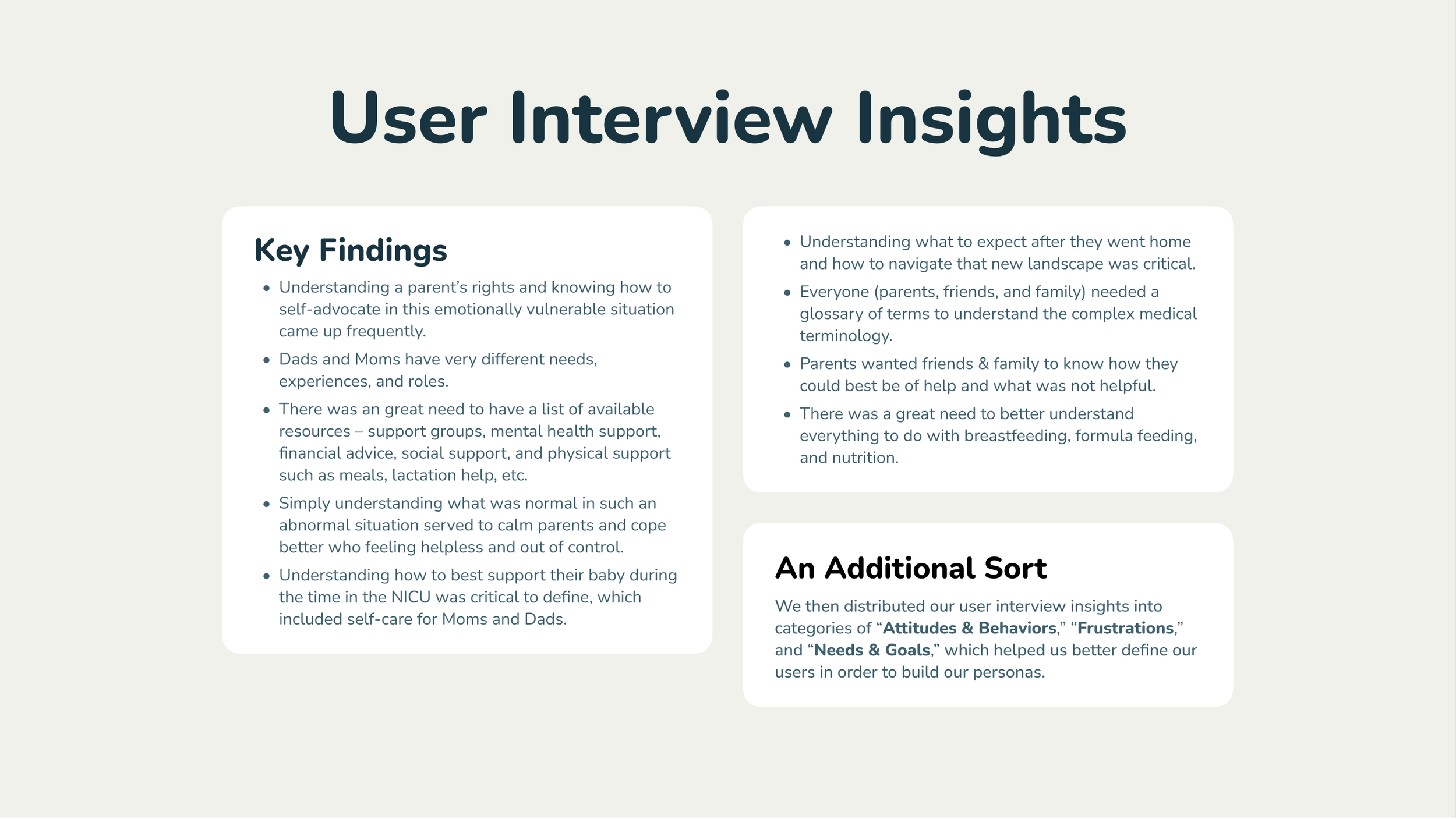
Affinity Mapping Joy. Out of all the methods we availed ourselves of, affinity mapping proved the most critical to understanding our users and what was important to include in the site content. We did 4 sorts in total, each revealing substantially different insights.