

Photo Editing the Visuals of a Book
These days, people think photo editing is little more than altering the color balance in images. But in reality, creating a compelling visual story with images — a story that makes you want to turn the page while it equally supports the words — is delicate balance of selecting the right photos, putting them in the right places, and using them at the right sizes.
Effective Photo Editing is about creating a melody and establishing a rhythm using images. This is done by utilizing their collective components — light, moments frozen in time which communicate emotion, and composition — to build that music. Here’s how I did it.
My Role: Photo Editor, Project Manager - Visuals
For this book, I decided the final product would best be supported if I created a dummy of the entire book. This had several benefits:
the designer could then use the dummy as a direct visual guide
it eliminated a laborious step the author would normally take of documenting each image
while it did make more work for me, it ensured the picture edit would not be misinterpreted, and we’d spend less time in the back and forth, so really it was a win-win for everyone
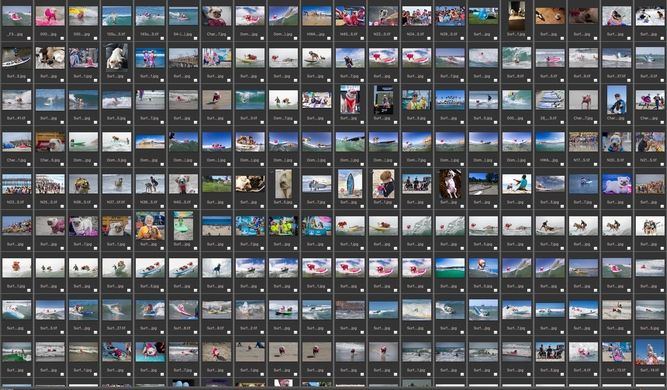
Five photographers and thousands of images to go through.
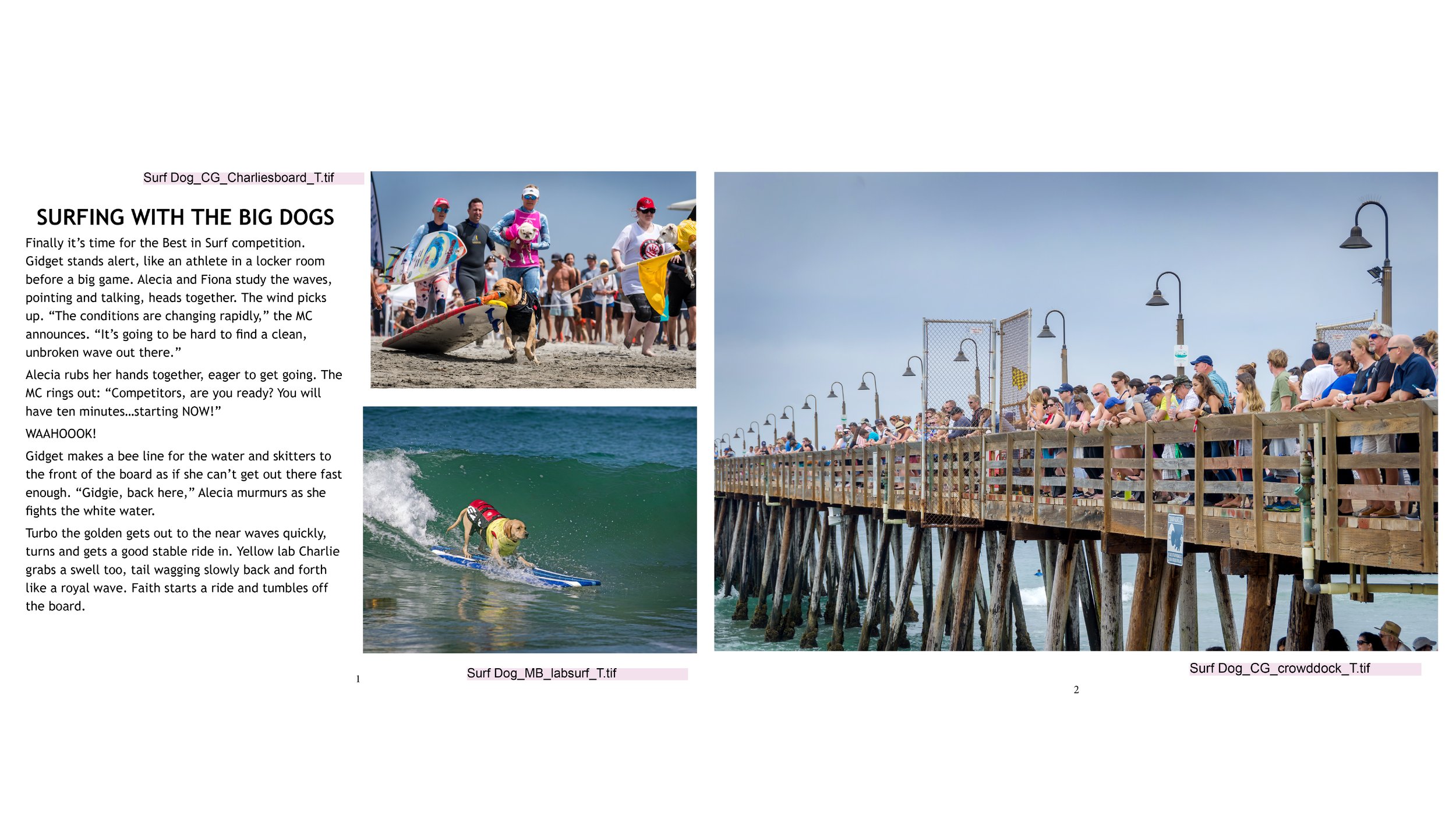
Using a wireframe I sketched, I laid out a book dummy in InDesign. This wasn’t meant to look fancy (that was the book designer’s job!) I then gave this dummy to the publisher who used it to work from.
Photos: top left, right: Charmagne Gray; bottom left: Michael Barton
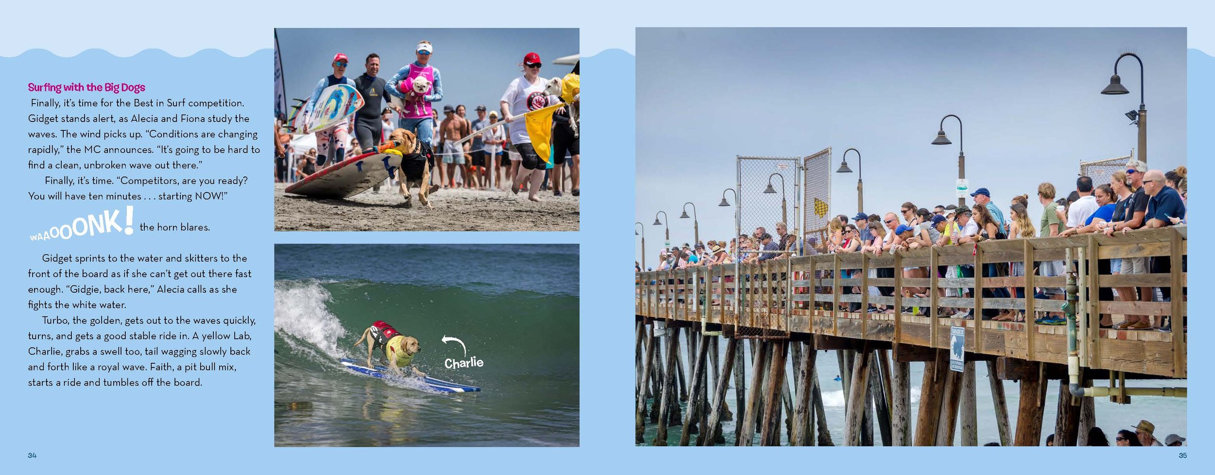
This is a pdf from the final book layout and what you would see if you ordered the actual awesome book.
Regarding the photo edit:
a mixture of images, which have both simple and more complex compositions, makes the spread feel more dynamic
the directional energy and compositions of the images are facing each other — into the spread/towards each other — to create cohesion between them
selecting a mixture of images — some with one, some with a few, some with many people — makes them more easily read because the eye is guided in a circular motion around the spread
I compensated for the lack of clear emotion in these action-only images by using them more as graphic elements to collectively communicate energy, which then results in a more emotive feeling
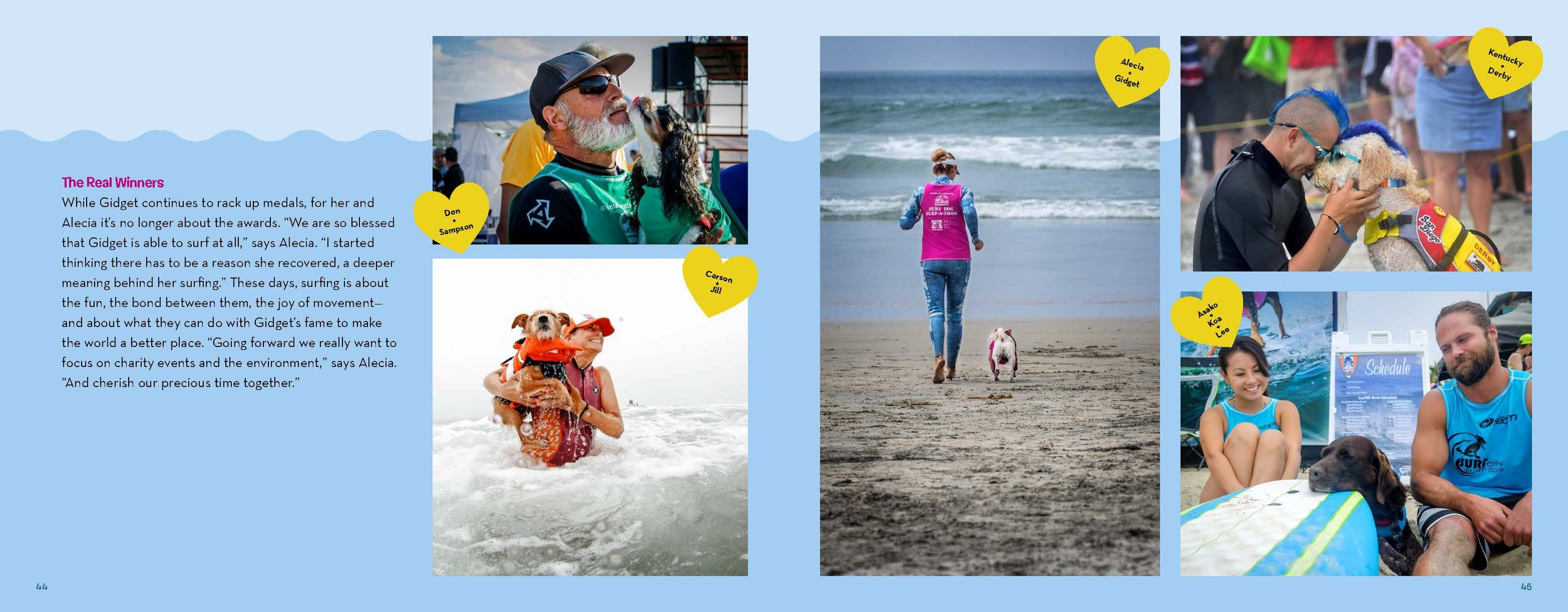
And finally…..Regarding the photo edit:
where possible, I chose images which exhibited an emotive quality to make the spread feel more dynamic and approachable for young readers
again — here I selected images, which had a variety of compositions to help the eye travel from one to another
Gidget is the most important character, so I put her in the center; from there I looked for other warm and fuzzy photos, which looked different enough from each other so that they weren’t redundant
varying the distance from the camera to the subject (tight, medium, and wide compositions) also helps the eye to travel
What People Are Saying
"The book's vibe is energetic and peppy, just like its protagonist"
— Kirkus
“The photography showing Gidget and her surfing competitions is charming and dynamic. . . . Readers can’t go wrong with the sheer kid-appeal of a surfing pug.”
— School Library Journal